Benjamin Moore Van Courtland Blue
Van Courtland Blue by Benjamin Moore should be on the top of your favorite paint list. This elegant Old World blue is timeless and effortlessly spans a range of styles.
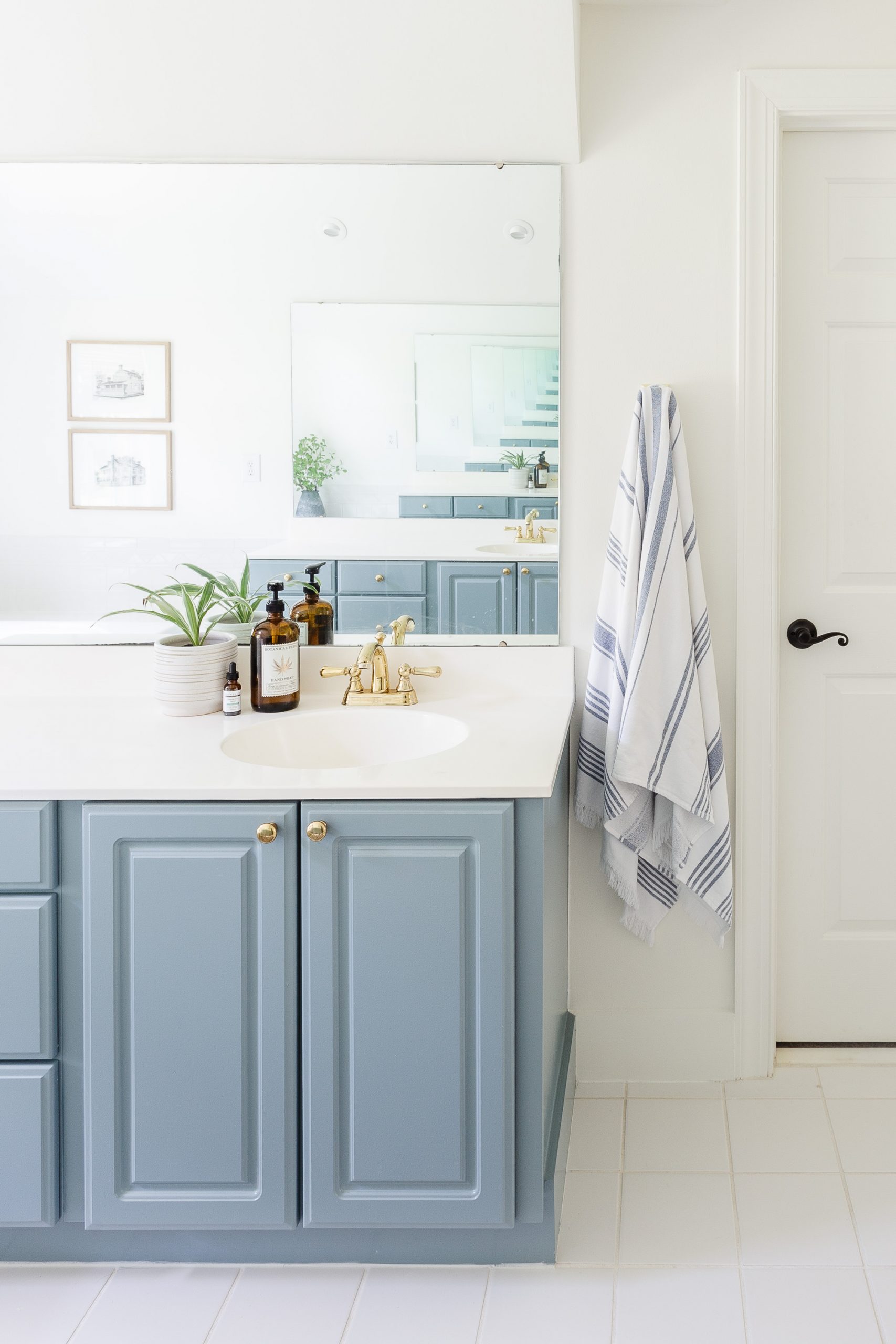
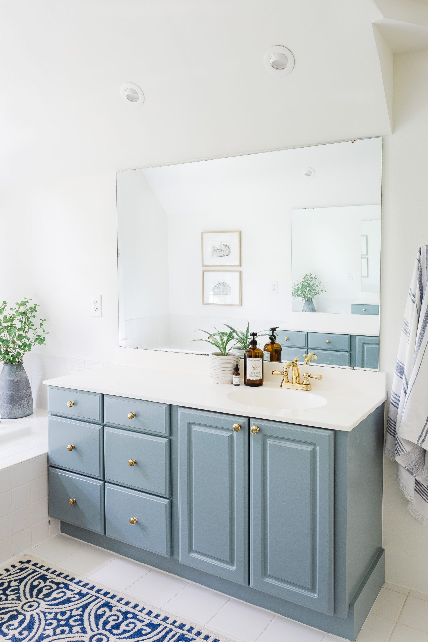
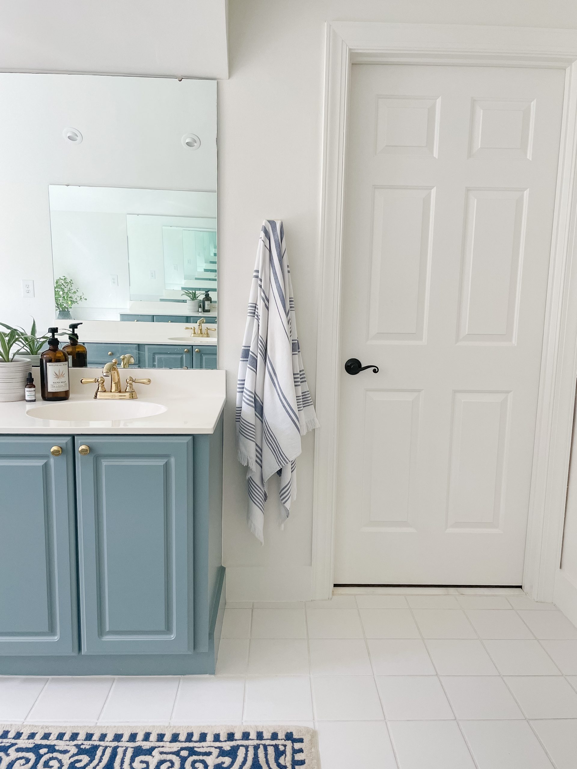
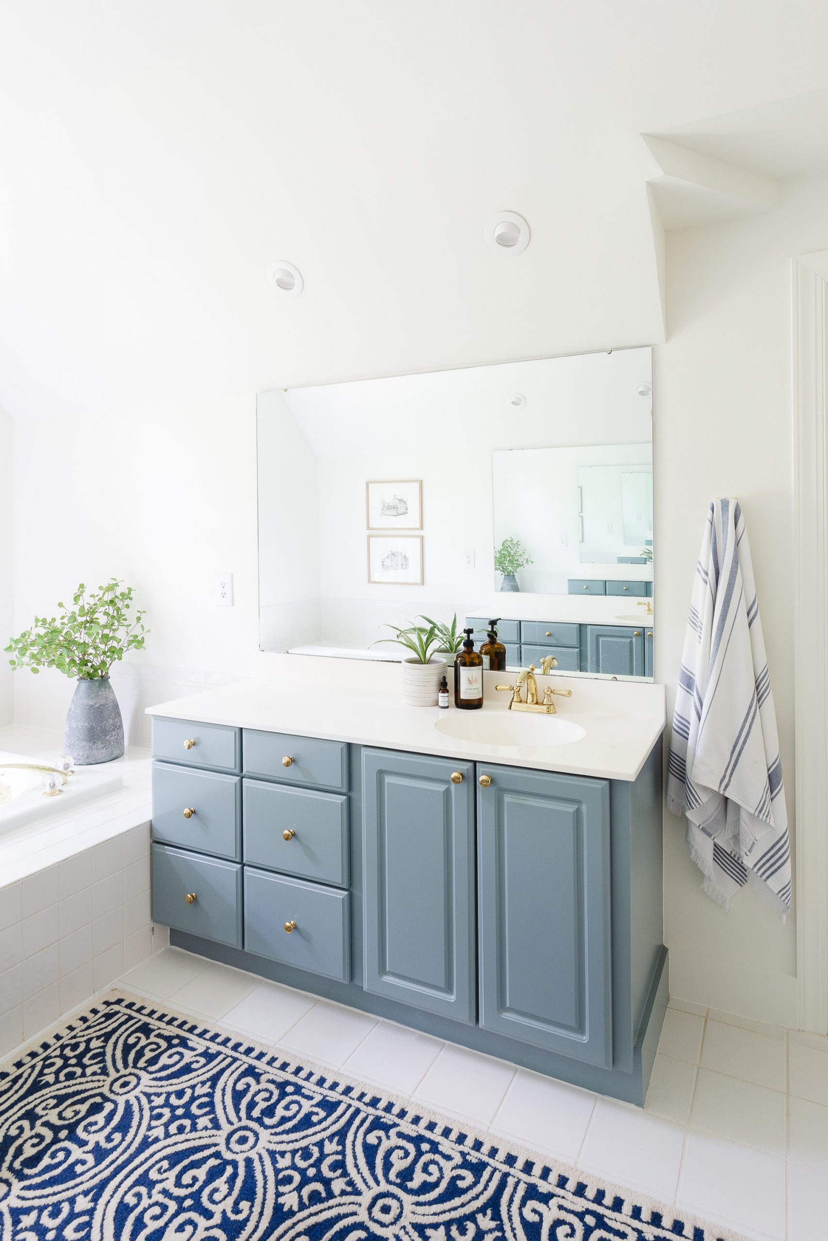
When I was looking to paint the vanities in our bathroom, the perfect blue paint color was on the top of the list. After looking at countless blue paint colors, I finally settled on BM Van Courtland Blue and couldn’t be happier. Since blue tones are my thing; this blue hue just made this space pop! I love it!
Disclosure: This post may contain affiliate links. As an Amazon Associate, I earn from qualifying purchases at no additional cost to you.
What Color is BM Van Courtland Blue
This blue paint is a cool, mid-tone paint color that isn’t too dark but also is not on the light side either. It’s right in the middle or thereabouts. Van Courtland Blue falls on the cooler side of paint tones, but can evoke a feeling of warmth. It belongs to the esteemed Historical Color Collection, a testament to its timeless appeal. This particular shade exudes an old-world elegance that is both profound and captivating. With a richness that speaks volumes, Van Courtland Blue enhances spaces with a sophistication that few colors can match. This blue hues depth adds a luxurious touch, making any room feel more refined and inviting.
“A decorative Old World blue that works equally well in more contemporary spaces, this timeless shade effortlessly spans a range of styles and sensibilities.” Benjamin Moore

LRV of BM Van Courtland Blue
Light Reflectance Value (LRV) explains how much light a color reflects or absorbs. LRV is great to understand when looking for paint colors.
Van Courtland Blue’s LRV is 31.47 and therefore registers at the lower end of the scale. This means this mid-tone blue color soaks up more light than it reflects. Various lighting conditions will alter how the shade is seen. In a well-lit room, the color might reveal subtle undertones, whereas, in dimmer settings, it appears more saturated.
The relatively low LRV is pivotal in achieving its rich, sophisticated look, perfect for creating ambiance in spaces large and small.
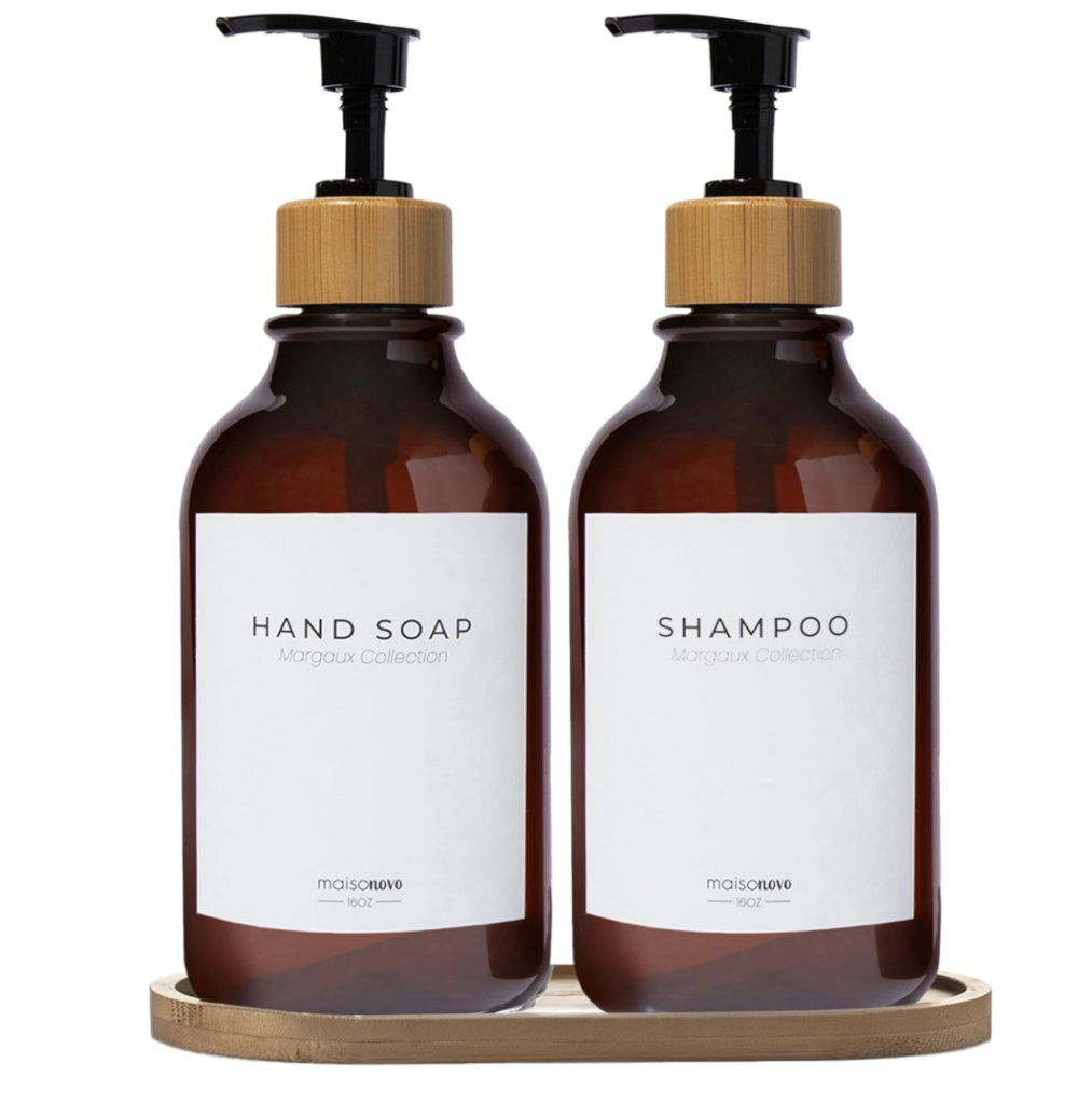
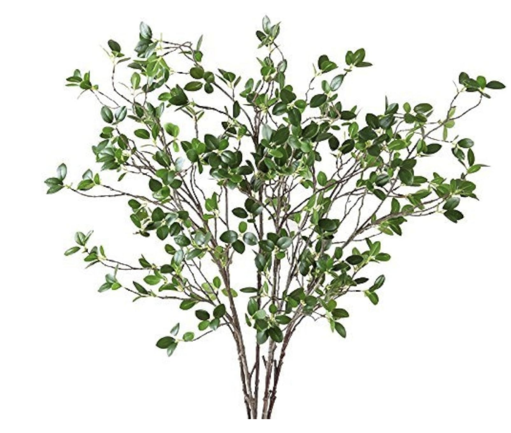
Blue Rug | Green Branches | Towels | Soap Jar | Brass Knobs
Is Van Courtland Blue Warm or Cool?
Benjamin Moore’s Van Courtland Blue is registered as cool, but in my opinion it nestles comfortably between warm and cool colors. The unique blend of undertones delivers an adaptable palette echo. This shade leans towards a cooler spectrum, but its subtle warmth allows for remarkable versatility. The underlying coolness brings a calm and serene vibe, perfect for contemporary spaces and adding a touch of sophistication.
Simultaneously, its warmth invites the familiar comforts associated with English Heritage. This duality ensures that whether a space commands a modern façade or a more traditional ambiance, Van Courtland Blue harmonizes effortlessly. This balance makes it a popular paint color. Understanding its temperature characteristics can guide us in creating perfect pairings for an aesthetically pleasing interior.
What Are the Undertones of BM Van Courtland Blue?
Undertones in paint are super important to understand. At its core, this warm blue flourishes with hints of velvety gray, providing a bridge between cool serenity and inviting warmth.
Blue is Benjamin Moore Van Courtland Blue undertone color. It reads and feels blue, but can also read green in different settings as well as gray. I would classify this as a gray-blue paint color, but can adjust in different lighting.
Check out these other posts!
Benjamin Moore White Dove OC-17
Benjamin Moore Simply White
Benjamin Moore Great Barrington Green
How Light Affects BM Van Courtland Blue
In natural lighting, this elegant hue unveils hidden depths, morphing from a subdued, sophisticated blue to a more vibrant, inviting color. Artificial light sources reveal another side, emphasizing cooler undertones that veer towards serenity and calmness.
Testing Van Courtland Blue in multiple lighting scenarios is important. Shades of dawn may not speak the same language as the glow of a lamp at dusk. The interaction between light and this rich color dictates the ambiance of your space, making it imperative to observe these effects. In east facing rooms, that get a lot of warm morning sunlight, this blue paint color can read a little green. Test your paint before you commit!
Our bathroom gets a lot of natural light and the space is bright, with high ceilings, causing the light to bounce off the cabinets with ease. This blue paint color feels natural in this space and showcases the lovely warm and cool tones of this blue paint color.
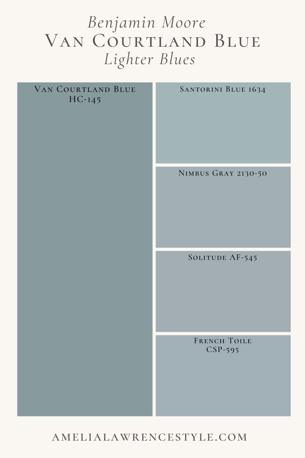
Lighter Shades
While Van Courtland Blue isn’t overly dark, it is not a light blue paint color. Although it is not a navy blue, it does have some darker depths to it.
These blue shades are lighter than Van Courtland Blue but have similar tones. Check out how they fall on the spectrum against Van Courtland Blue.
- Benjamin Moore Santorini Blue 1634 – Refreshing cool blue that features a touch of gray
- Benjamin Moore Nimbus Gray 2130-50 – Medium neutral blue paint that has a cool gray undertone
- Benjamin Moore Solitude AF-545 – A modern blue-gray that creates a clean slate
- Benjamin Moore French Toile CSP-595 – This is a cool, soft blue that evokes a peaceful setting
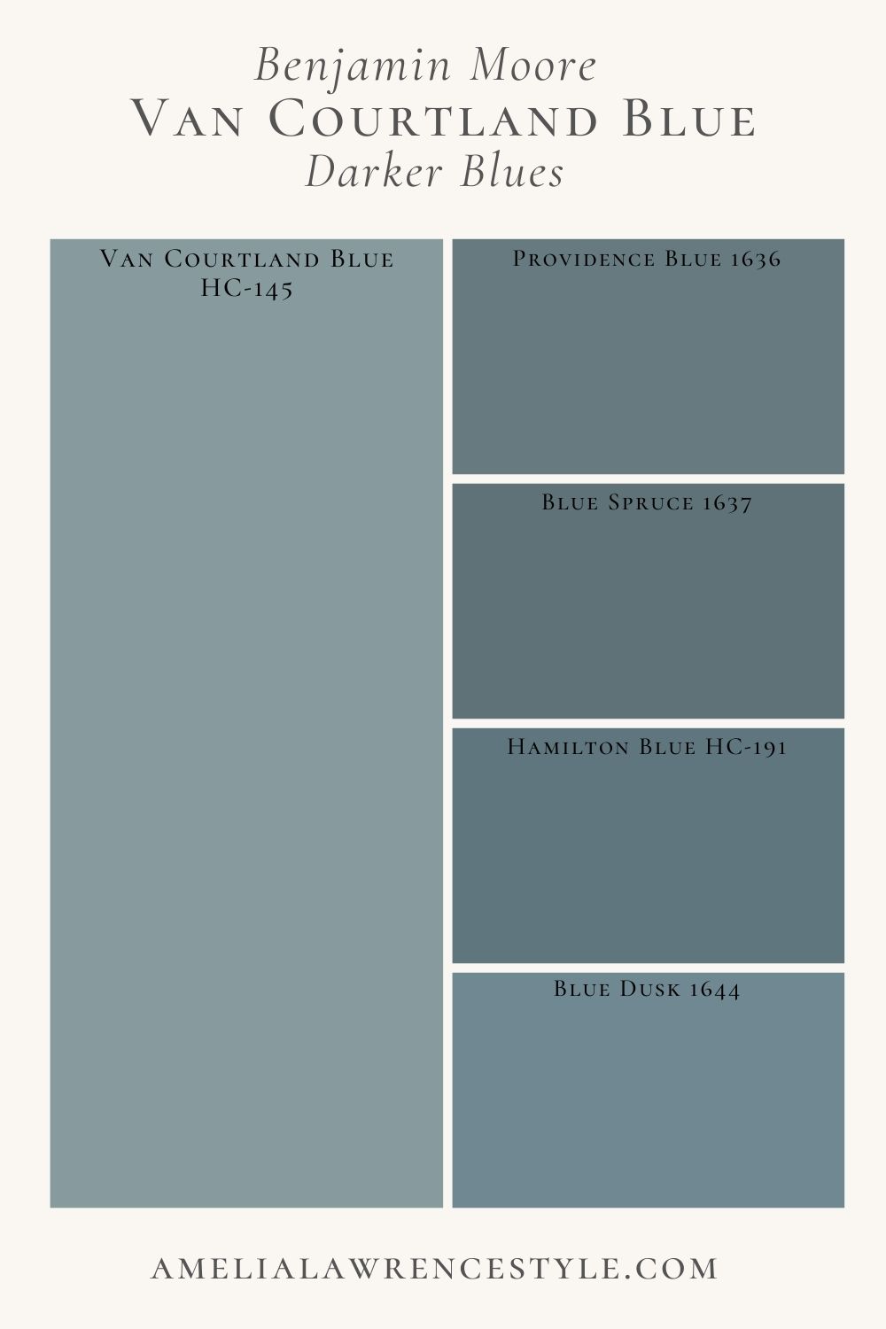
Darker Blue Paint Colors
Since this blue paint color is more mid-tone; you are going to find a variety of lighter and darker blue shades. Here you can see a few darker blue paint colors to consider. These are similar in tone to BM Van Courtland Blue but are darker overall. These darker blue paint colors will have gray and green undertones.
- Benjamin Moore Providence Blue 1636 – A cool-toned slate blue with dark gray undertones
- Benjamin Moore Blue Spruce 1637 – A saturated blue with hints of green and gray
- Benjamin Moore Hamilton Blue HC-191 – A dark, stony shade of blue
- Benjamin Moore Blue Dusk 1644 – A muted ocean blue with gray undertone bringing depth

Tips
- Van Courtland Blue is a lovely blue in bright, open spaces but can look darker or even lean more green in certain lightings.
- Test this paint color in all lighting to ensure it works for your space.
- Pair this paint color with lovely shades of white, browns or even lighter blues.
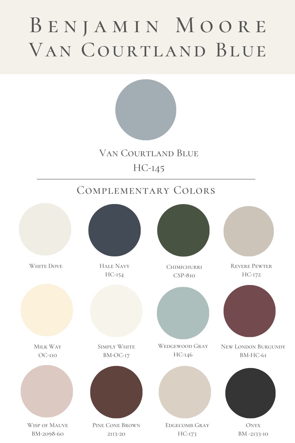
Complementary Colors for Van Courtland Blue
Benjamin Moore Wedgewood Gray HC-146 is a classic soft blue and is very versatile. It would pair nicely with Van Courtland Blue as an accent paint color. Benjamin Moore Simply White OC-117 also coordinates nicely with Van Courtland Blue for trim or doors. BM White Dove also works well with this blue paint color; it is warmer than Simply White.
The walls in this bathroom are painting BM White Dove which offers wonderful undertones and feels warm for a white paint color. It is my favorite white paint color.
Benjamin Moore Milky Way OC-110 is bright white emanating with warmth and can feel more yellow than Simply White or White Dove, but it pairs nicely with this mid-tone blue paint color.
Amazon Storefront
Follow my Amazon Storefront to find more looks for less and all our finds!
Sources


Frequently Asked Questions
Follow along: Instagram | Pinterest | LiketoKnowit